Flippin' Dots
Post Metadata
The Starbucks Reserve Roastery near me abruptly closed. This news was a big bummer, but not necessarily because of the coffee quality. They had this huge split flap sign whose pleasant waterfall patter washed over the cafe when its message changed, and served as lovely background noise when you were bringing your tourist family around to shop for souvenirs or nibbling on a croissant sandwich and a reading group paper.
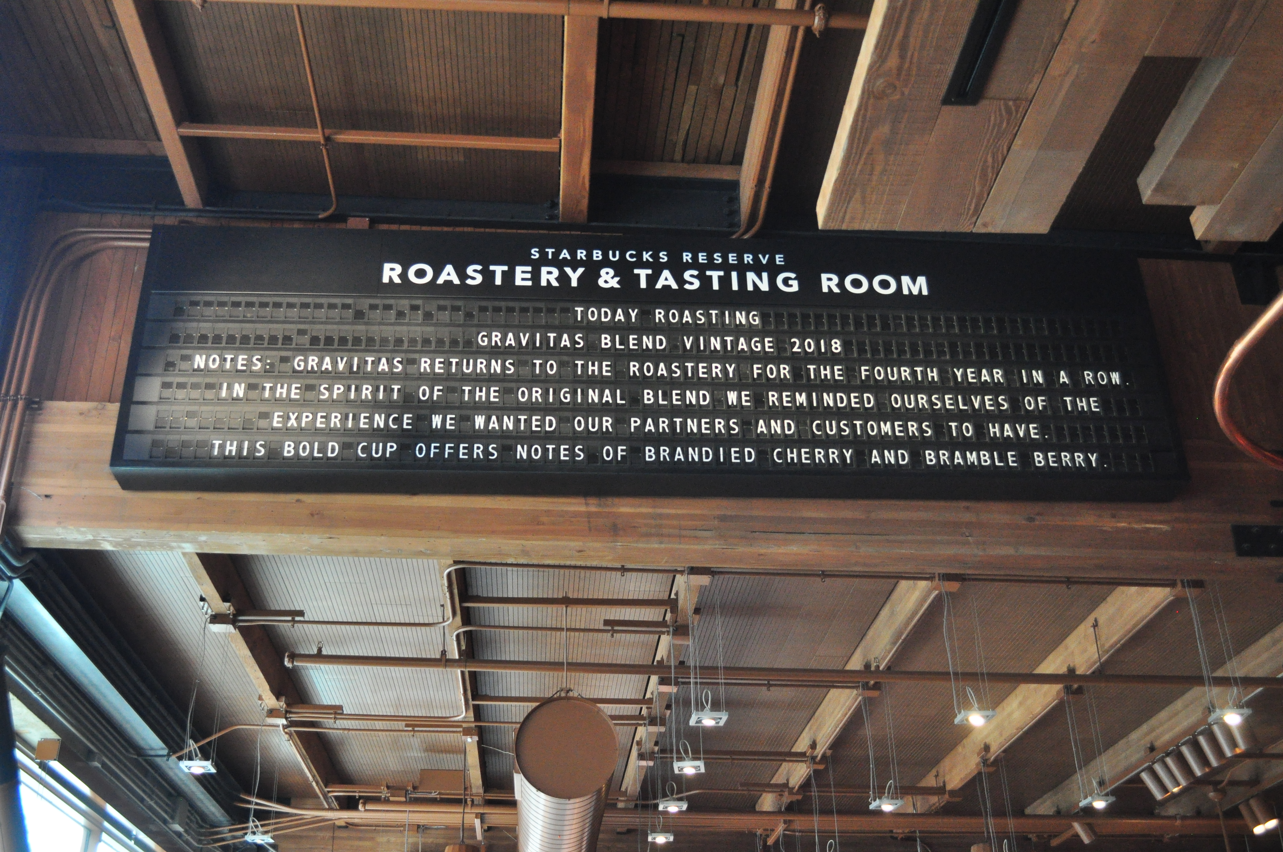
Image source: https://commons.wikimedia.org/wiki/File:Starbucks_Reserve_Roastery_interior_21.jpg
I’m not the only one who enjoys these kinds of novel, physical, analog displays. Companies like Oat Foundry and Breakfast Studio are well-known for their custom installations that push the boundaries of what can be done artistically with these technologies. Hackers around the world have refurbished, upgraded, and hacked on existing displays, as well as created prototypes of novel display technology. Even Adobe has a research department working on Primrose, a flexible smart-window material type of display with an eye towards applications in everything from fashion to building-scale architecture.
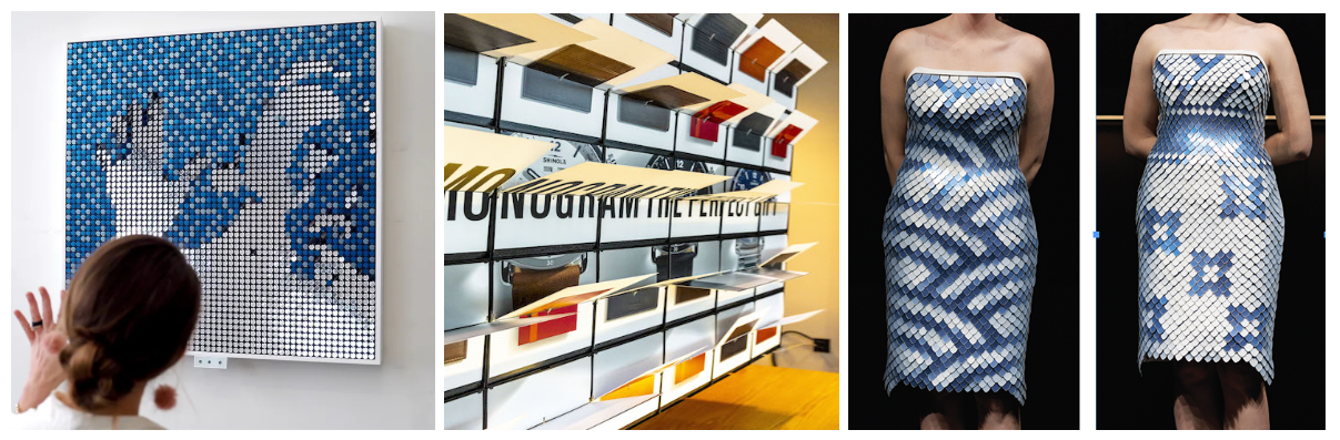 Left to right: Flip dot mirror by Breakfast, Picture flaps by Oat Foundry, Primrose dress by Adobe.
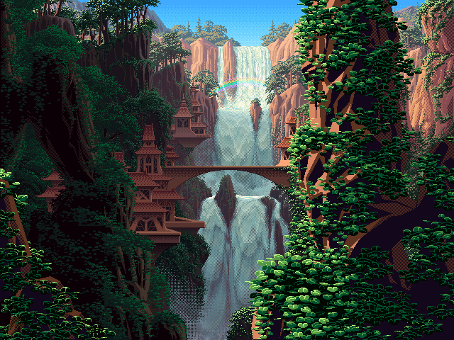
But what exactly do we enjoy about these displays? Is it pure nostalgia, a yearning for a simpler time? A gentle visual and auditory experience in the age of blaring digital screens and speakers? The idea that even after decades of power loss, they will continue to shout on their last known message? Personally, I enjoy the constrained nature of these displays. It’s often said that really interesting art is born from working against constraints. Just take a look at colour cycling (I think these are some of the coolest demos on the internet):
The idea is born out of indexed graphics: rather than recording the full colour data per pixel, which uses a ton of memory, we could save all the colours we’re going to use as a palette and only record an index into it. But if you wanted to update your image (say for animating), it’d still be really costly to load all new indices. What if instead you just swapped out the palette you were indexing from? So to animate a sunrise, you might start with a palette of dark blues, then move through oranges and reds, and then reach sky blue to get daytime. My point is, these kinds of solutions for constrained problems create pieces with a distinct character, and we embrace that look for its charm. We love the medium for what it is!
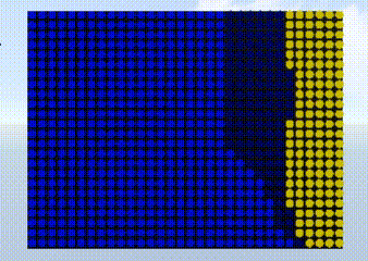
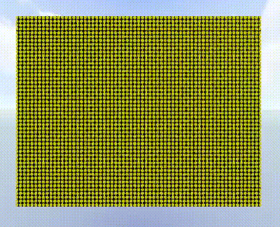
So what about, say, designing flip dot content? What does it look like? Well, for starters, it’s not like you can just use a file that was designed for the average computer monitor with millions of dots – at 8.9mm diameter per dot, the flipdot equivalent of a 4k-resolution screen would take up at least 1345 inches x 757 inches. That’s 37 x 21 yards, which is like, two semitrucks long by a bowling lane tall, for you Americans out there. Also, what might be the bigger problem is that the colour palettes tend to be extremely limited. Trying to display a full-colour video is going to be really difficult if you’re only choosing from one of two colours (in the case of flip dots) or need to spend a long and variable amount of time updating the pixel (in the case of split flaps). So if you have anything in mind other than Bad Apple, you’re probably pretty stuck.
 (But you can make Bad Apple!)
Summarizing the state of affairs:
- These displays are ultra low-resolution
- They have a very limited colour palette
- There are restrictions on how fast and where pixels can update
But there are also unique properties that we can take advantage of:
- They make pleasing noises
- Their dots don’t have to be arranged rectilinearly
- There is often inherent motion associated with the update that we can use to our perceptual advantage.
- Dots can have sub-pixel patterns
So then the question is, what kind of system can I build that lets me translate my content for different types of hardware and find that special character? I want to be aware of the constraints like having a low resolution, but I also want to employ effects that might enhance my content. In fact, these effects can help suggest visual content that transcends the lowered resolution; for example, if the wind is blowing a leaf across the screen, it could make sense to have the flip dots move in a path to emphasize the kinetic energy. That would be pretty difficult to do with a digital screen, and also works without a fine level of detail!
Here’s the first attempt at the idea, which I’ll go over at a high level. The central tenet here is getting control over what dots are changing state and when. For now, I’m going to focus on flip dots, as they are the simplest medium we’re using. Consider these two frames that we’re transitioning between:


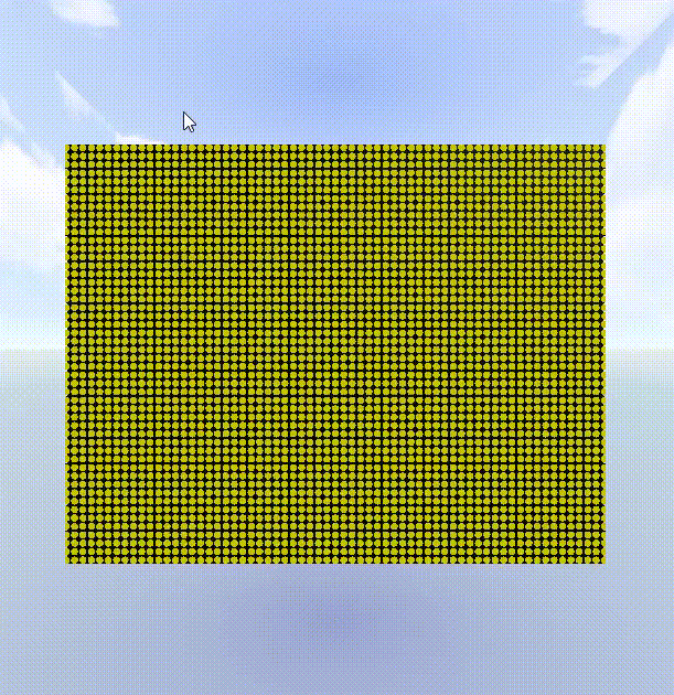
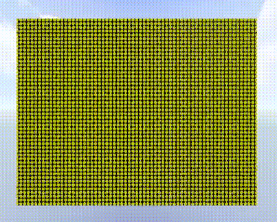
Green background used for visibility purposes.
We have a bunch of options for how to transition between them. Do we just flip from one frame to the next?
Perhaps we want to suggest that the content is being wiped away?
Or we want to suggest that it is emerging from some kind of uncertain noise?
Maybe we want to sync up that reveal to some kind of rhythm?
In some ways, the input and output frames are a specification (they cannot change!), but we can play with the way that the dots change to transition between them – and we can think of that as being governed by a schedule. So, our prototype system uses a simple declarative interface to express the schedules of each frame and the pieces within them.
Let’s break down one example. Take this simple example of a golf ball getting hit and flying away. Here is what the program looks like:
timing: [1,1,1,1,1,1,1,1]
filepath: /animations/golf-collide${i}.png
objects: [#000000 golfstick] [#5fcde4 golfer] [#5b6ee1 ball]
golfstick 0 ->* instantaneous ->* golfstick 7
golfer 0 ->* instantaneous ->* golfer 7
ball 4 ->* instantaneous ->* ball 7
And here is the result, rendered in my three.js flipdot simulator:
The first line declares how many frames are in the input and how “long”, generally speaking, to spend on each frame. We can stagger the updates by making some frames take longer. The second line specifies the file path to our input, which is a set of keyframes. I’ve drawn the keyframes for this example myself, and they show a little stick figure hitting a golf ball (no comments on their form please, they are still learning how to golf):
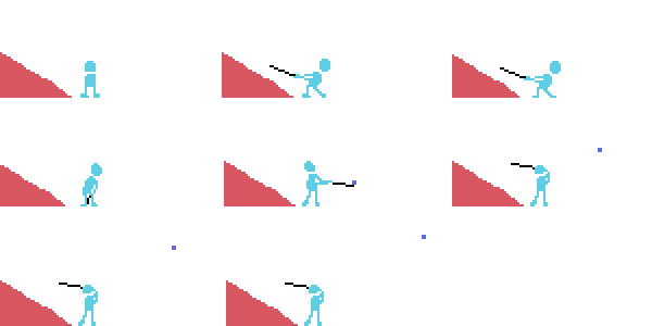
(This input shows a golfer hitting a golf ball. The golfer’s body is light blue, the golf club is black, the golf ball is dark blue, and the mountainous slope backdrop is pink.)
The third line tells us what Objects are in the input, which we use colour to delineate. By Object, I mean a collection of dots and their states (e.g., the golf ball Object is a 2x2 grid of all coloured dots). You can think of a program as constructing a graph of objects and how they change over time, something like this, where circles represent objects and squares represent transitions:
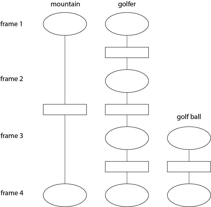
(N.B. the structure of this diagram does not perfectly match the current example)
So the last three lines in the program are compiled into individual graphs. A valid transition graph, such as ball 4 ->* instantaneous ->* ball 7, is given by Selector (-> Transition -> Selector)*. A selector is an Object (taken from the named Objects line) and a frame id (e.g. ball 4). So, if I simply declare ball 4, then the golf ball from frame 4 will appear at frame 4. Any objects not given on these lines do not appear in the animation. Note how the mountain (which was indicated in pink in the input) has disappeared in the final animation!
(N.B. You may be wondering why the example uses ->* instead of ->. ->* is just syntactic sugar that expands the declaration over all frames. So, A 1 ->* t ->* A 3 would expand to A 1 -> t -> A 2 -> t -> A 3.)
Now let’s focus on transitions. The transition is used to compute the object for each new subframe, describing how the object transforms from its state at frame f1 to its state at f2. For example, instantaneous just means “go from f1 to f2 without anything in between”. f1 and f2 need not be sequential; if they are not, the transition will generate objects for all intervening frames and subframes. Thus, the schedule (i.e. when each dot flips) is dictated by the transitions we choose, and we can make a bunch of different schedules by switching out the transitions.
So instead, we could interpolate the path of the golf ball to make it move more smoothly:
golfstick 0 ->* instantaneous ->* golfstick 7
golfer 0 ->* instantaneous ->* golfer 7
ball 4 ->* move ->* ball 7
and we get this:
Or record parts of its path as it moves like so:
golfstick 0 ->* instantaneous ->* golfstick 7
golfer 0 ->* instantaneous ->* golfer 7
ball 4 ->* move ->* ball 7
ball 4 ->* path ->* ball 7
And that’s the basics of it! Of course, there are plenty of other things you could want to play with that we haven’t covered here. For example, we haven’t really touched on how you might want to manipulate the setup of your display for different types of content –- like engineering the colour layout to allow you to display multicolour videos. (Something like this?)
Source clip taken from Cinderella (2015). (The costuming is so great…)
Right now, we’re working on adapting this system for new types of hardware, including Primrose, and show how you can generally adapt it, even when you want it to work on Pixel Track, refreshable braille displays, or even marching bands!
Acknowledgements. Thanks to everyone who helped with this work and gave inspiration, especially my mentors at Adobe, Alec Jacobson and TJ Rhodes, and my advisors at UW and Brown, Zachary Tatlock and Adriana Schulz!