Designing Knitted Illusions
One of the great joys of being a researcher is observing an interesting phenomenon and deciding that you want to understand it and recreate it. Then there’s the additional joy of being a knitting researcher, and having that phenomenon be a cool object you can also display in your house or wear!
In the vein of spelunking for natural phenomena, one of my advisors, Zachary Tatlock, discovered the website WoollyThoughts from English mathematicians Pat Ashforth and Steve Plummer, a comprehensive craft resource and gallery dedicated to the art of illusion knitting (and shadow knitting, which I won’t get into).1
1 The earliest mention I’ve seen of illusion knitting is actually in Nihon Vogue 1982, but WoollyThoughts has probably the most comprehensive cache of English-language illusion information.
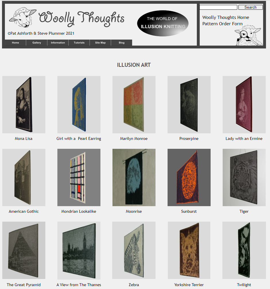
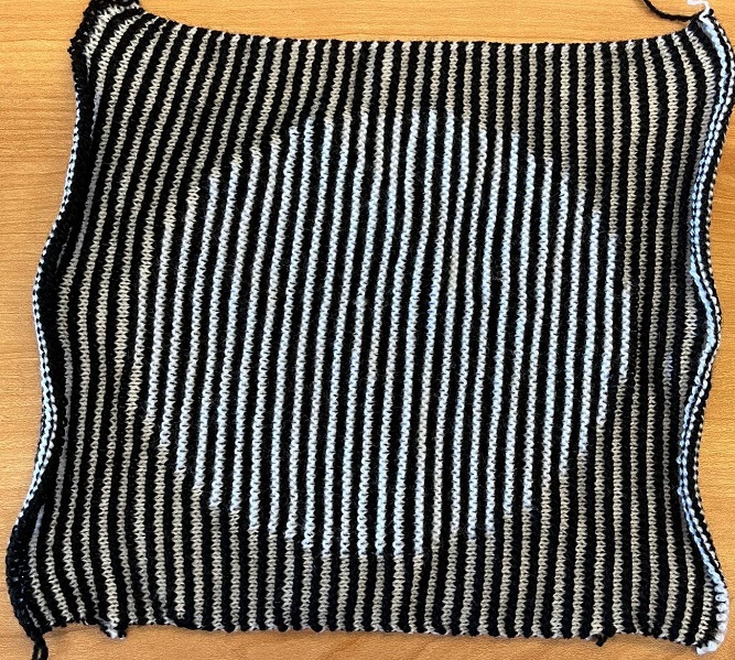
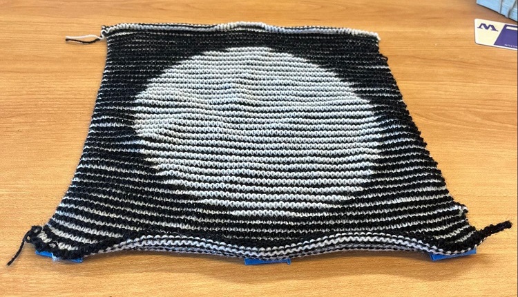
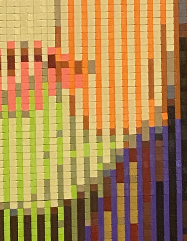
Illusion knitting produces knit planes that, when viewed head-on, appear to be meaningless and shapeless gray rectangles, perhaps hung up for soundproofing or to cover wall damage after an ill-advised evening of imbitition. Walk around the mounted image, however, and magic happens: an image emerges from the noise.
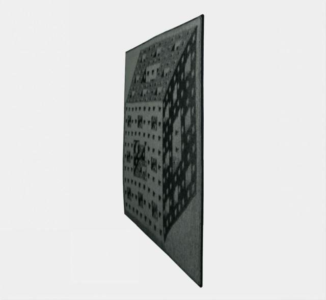
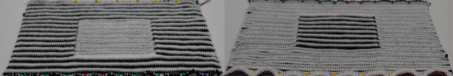
If you’re as craft-inclined as I am, you might be wondering how these objects are designed and fabricated. Luckily, WoollyThoughts has a couple tutorials on doing exactly that. If we give them a read, we see that… well, the process is importing your input into Excel and meticulously colouring in your design cell-by-cell, with a workflow that involves completing small sections at a time and knitting them up and adjusting accordingly. Large designs apparently take hundreds of hours to plot and yet hundreds more to knit up.
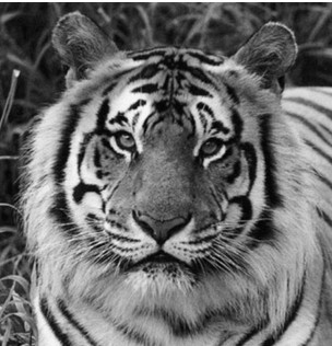
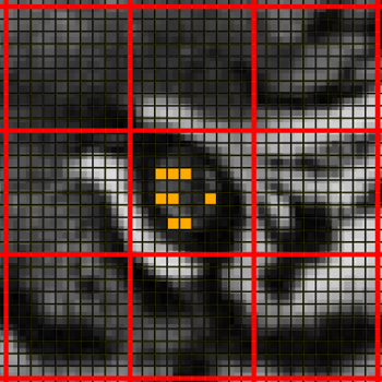
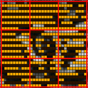
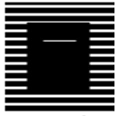
Above is a picture of a Tiger, zoomed into the eye level detail, and with a grid overlaid to make designing the patterns easier. Pat generates the patterns by placing orange tiles and black tiles down, which correspond to what is seen in the angled view of the knitted object. Further detail on the manual design process is in this tutorial.
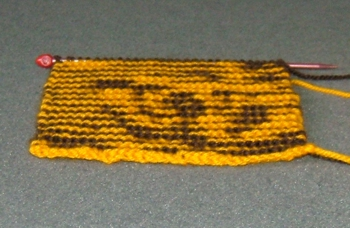
Now here’s the final design for the zoomed-in eye section. Pat then knits up this section to see if any details need to be adjusted, seen below.
So right off the bat, this Excel-cell-placement task seems like a great candidate for automation!
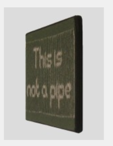
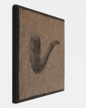
Another aspect of the website caught my interest while I was scrolling around. They’d made this example with Magritte’s Treachery of Images, where it seemed at first that the image of a pipe was viewable from one side, and the text “This is not a pipe” was viewable from the other. After some rigorous gif-watching investigation, it turned out these were actually two separate knitted objects put together in one animation. But it got us thinking – would it be possible to create illusions with two different image effects embedded in one object?
 |
 |
To rehash our journey thus far, we want to find ways to make the design and fabrication of illusion knits computationally-assisted, and find a way to expand them to double-view images. For double-view images, we care that one image is obvious in the left view, and a different image is obvious in the right view (and discard the head-on view entirely so we have more degrees of freedom). In this blog post, I’ll focus on the design aspect. However, we also needed to examine the physical knitted objects to understand how it was possible to consistently manufacture the desired patterns, and make contributions to knitting machine scheduling to actually fabricate these objects. I’ll save the nitty-gritty of that for another time!
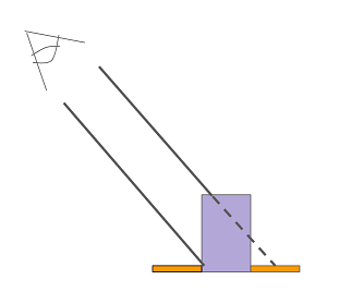
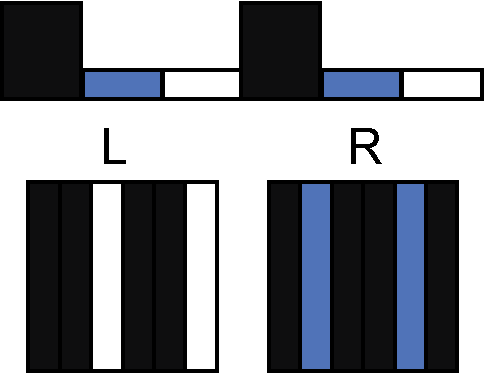
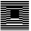
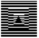
So let’s get started on our monomyth and delve into the secrets of illusion knitting. Our first step bringing us into the underworld is asking: how does illusion knitting actually work? It relies on a simple principle that doesn’t require any knitting background to understand. Some rows of stitches are taller than others, so that when they’re viewed at an angle, the tall ones (purple in the image below) block shorter rows (orange) directly behind them.
Take the example of a circle with a white foreground and black background.

Let’s turn this into an illusion knit so that the circle appears in the side view. We need the head-on view to be a nondescript image that conceals the surprise, and because the height information is flattened when viewed head-on, the colour map completely determines what is visible. So, set the colour map to be stripes. Then, to modify what we see at an angle, we need to manipulate the height map! At each point inside the circle, we should raise the stitches that correspond to the foreground colour. At each point outside the circle, we should raise the stitches corresponding to the background colour.
Now, you might ask what it means to raise a stitch or what physical operation this corresponds to. Great question! In our work, we characterize something new that we call “microgeometry”: the small-scale geometry on the surface of a knitted piece. We introduce a layer of abstraction over the microgeometry to use when designing illusion knitting patterns. This layer uses “logical” units BUMP, which correspond to raising the knit surface, and FLAT, which correspond to leaving the knit surface level, and we assume it’s always possible to manufacture the microgeometry associated with these units. Speaking in terms of knitting, a BUMP is a knit with a purl in the next row directly below it, and FLAT is a knit with a knit in the next row. In particular, in our work, the microgeometry is such that each of these BUMP units is the same height, rectangular (so the top face of the microgeometry is always visible), and one solid colour throughout.
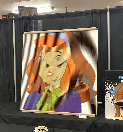
I specifically mention these physical attributes because when I was in the abyssal death and rebirth phase of the hero’s journey, wracking my brain to make double-view illusions actually possible, I went to a LEGO convention with some friends and was totally gobsmacked to see that someone had already created a simple but effective illusion object. They had probably had some extremely obvious insight that I had been foolishly blind to and precious months of my life were jettisoned like so much kitchen scrap into the garburator. On closer examination, the LEGO piece used a series of row-aligned pyramidals units such that the left side of each pyramid was completely obscured when viewed from the right, and thus each input image was sliced into rows and stuck on their respective side of the pyramid. As each knitted bump is made with a single yarn colour, this technique doesn’t apply in knitting, and my work (and stable footing in this plane of existence) is safe.2
 |
 |
Daphne/Azula illusion made with Lego.
An artist’s interpretation of how the Lego illusion is constructed.
2 It is technically possible, but the effect is not very precise. Rather than seeing yellow on one side and orange on the other, you’d see about two-thirds yellow and one-third orange on one side, and one-third yellow and two-thirds orange on the other side. Incorporating this style of stitch could be an interesting extension.
Now we have an intuitive understanding of how illusions are created. But what does it mean for the knitted illusion to be correct? Well, we can formalize this notion of a “correct” illusion simply and algorithmically by predicting what the final knitted object will look like and ensuring that it matches the input object. In this model, we assume that the illusion is viewable when you’re looking down the rows (or courses), i.e. a stitch in one row blocks the stitch in the row beyond it.
For each row, where C is the colour map (a 1D array of integers) and R is the raisedness map (a 1D array of booleans), and i corresponds to the column number within the row, we have:
\((C_i = input_i \wedge \neg R_{i-1}) \vee (C_{i-1} = input_i \wedge R_{i-1})\)
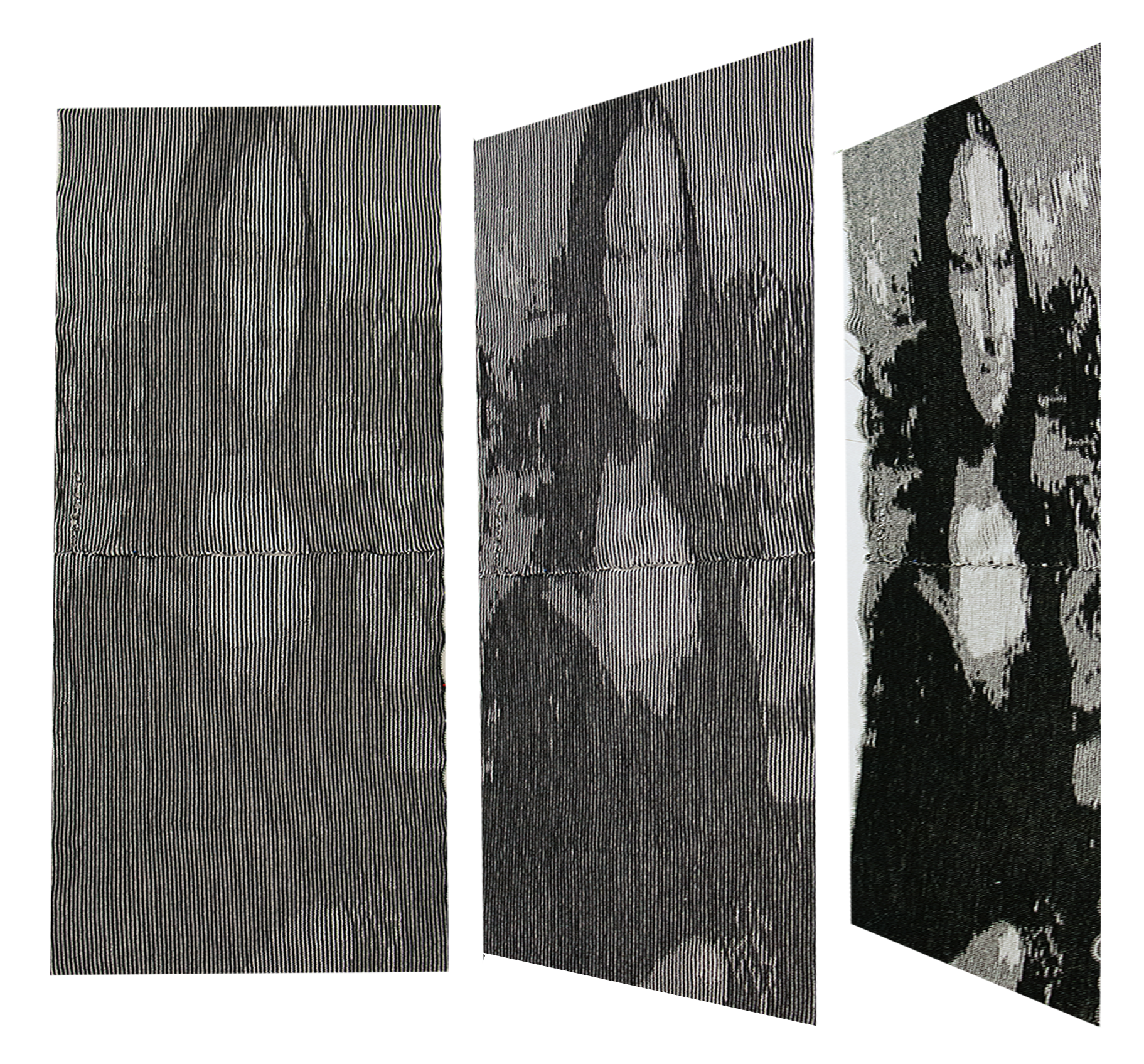
Great news – these constraints are basically enough to guarantee that for a two-colour single-view image, we can generate a pattern satisfying all the constraints. Going beyond two colours, you can approximate a three-colour image by making a middle colour with your two colours striped. We did this with a picture of the Mona Lisa. It took less than a minute to generate this illusion design, and most of the time was resizing the image and loading it into our tool.
With these constraints, we can turn back to our double-view problem. We have a perfectly good set of constraints that are generated for a set of input objects; why not try to generate those constraints for both sides and throw the thing into a solver? Let’s give each of these pixels an equal weight and formulate the problem as MaxSAT, where we try to satisfy the most constraints.
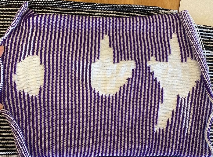
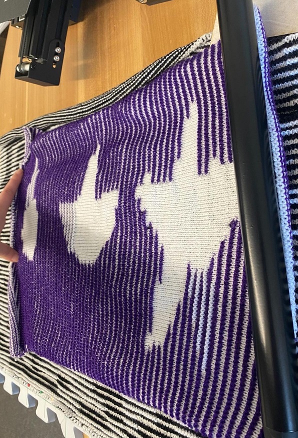
So, we wrote a program that took two images, generated constraints such that the left side appears to be the first input, and the right side appears to be the second input. If we just ask the SAT solver to synthesize the solution, we get this:
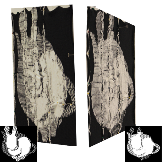
The predicted result isn’t too bad. In fact, it’s optimal. MaxSAT shows us that for two inputs that completely differ, we can do at best 75% matching in one view and 75% in the other. In reality though, I’m not pleased with what we were able to do with MaxSAT. The artifacts are still very obvious when we actually look! Also, the resulting pattern takes about 12 hours to knit on the knitting machine, which is pretty slow. It’s also such a large pattern that we have to divide it into 8 pieces for each piece to fit in the machine memory.
I’d like to do better, perceptually speaking. Satisfying the constraints as given seem hopeless – as currently formulated, we can’t do better than satisfying 75% of them. There’s just no way any two arbitrary images are satisfiable. At this point, let’s take a step back and examine the kinds of two-view effects that are actually possible.
The simplest definition of a two-view effect would be some colour, colour A visible from the left, and another colour, B, visible from the right. Let’s say A is white and B is black. We already know that having white and black opposed is impossible. To get an occlusion effect, some stitches have to be raised, but all raised stitches are visible from both sides.
First off, notice that we can get an extra degree of freedom by having two flat rows for every bump row. In the left view below, half the flat rows are obscured and half are visible; in the right view, the exact opposite set is visible and obscured.
What if, instead, we asked for white to be visible from the left, and a striped pattern of white and black to be visible from the right? Then, we end up with the following result (one knit object viewed from opposite sides):
The stripe of black and white recalls the use of stripes in single-view illusions to create a middle gray colour.
Now we’ve successfully created a two-view effect!
So, here’s a new idea for creating illusions from two arbitrary input images that is perceptually better than just minimizing constraint violations. We can probably replace some of the input’s original colours with striped “fills”, while keeping the images recognizable. In other words, we’re systematically relaxing the constraints (by modifying the input images) until an illusion becomes realizable.
In this workflow, we accept pre-quantized images (such that a user is free to use their favourite image quantization software), “recolour” them, and generate a new pattern thusly:
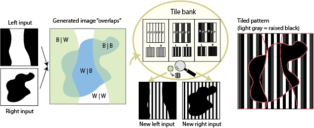
Using the stripes as guidance3, we have a tile template bank that we can draw from to automatically finds viable new assignments of input colours to these pattern “fills” thusly:
- Overlap the two images so that for each pixel, we know what colour it should be on the right and left
- Collect all unique colour overlaps (e.g. white | black, black | black, white | white, black | white)
- Go through each input colour and try to assign a new fill type (solid or striped of a specific colour)
- Check all overlaps: given my new recolouring, do I have a possible tile for each overlap? If not, this assignment isn’t viable.
- Finally, do a lightness order check
The key to this setup, perceptually, is that we have multiple tiles that can map to a specific fill on one side. For example, to see black-and-white stripe in the left view, we could use the tile above, or we could simply use an all-flat striped tile. This flexibility will let us “hide” the other-view images better, since we have a way to keep the fill the same in one view even as it changes in the other view! Speaking in terms of the monomyth, this is the transformation that will allow us to return to the known world.
3 How did we determine the templates for the tile template bank? Mostly simplicity and fabricability. You could design more complex tiles, e.g. checkerboard instead of stripes, but it would take longer to knit. Also, stripes have established usage in traditional illusion knitting designs.
Let’s look at some examples that we made using this approach.
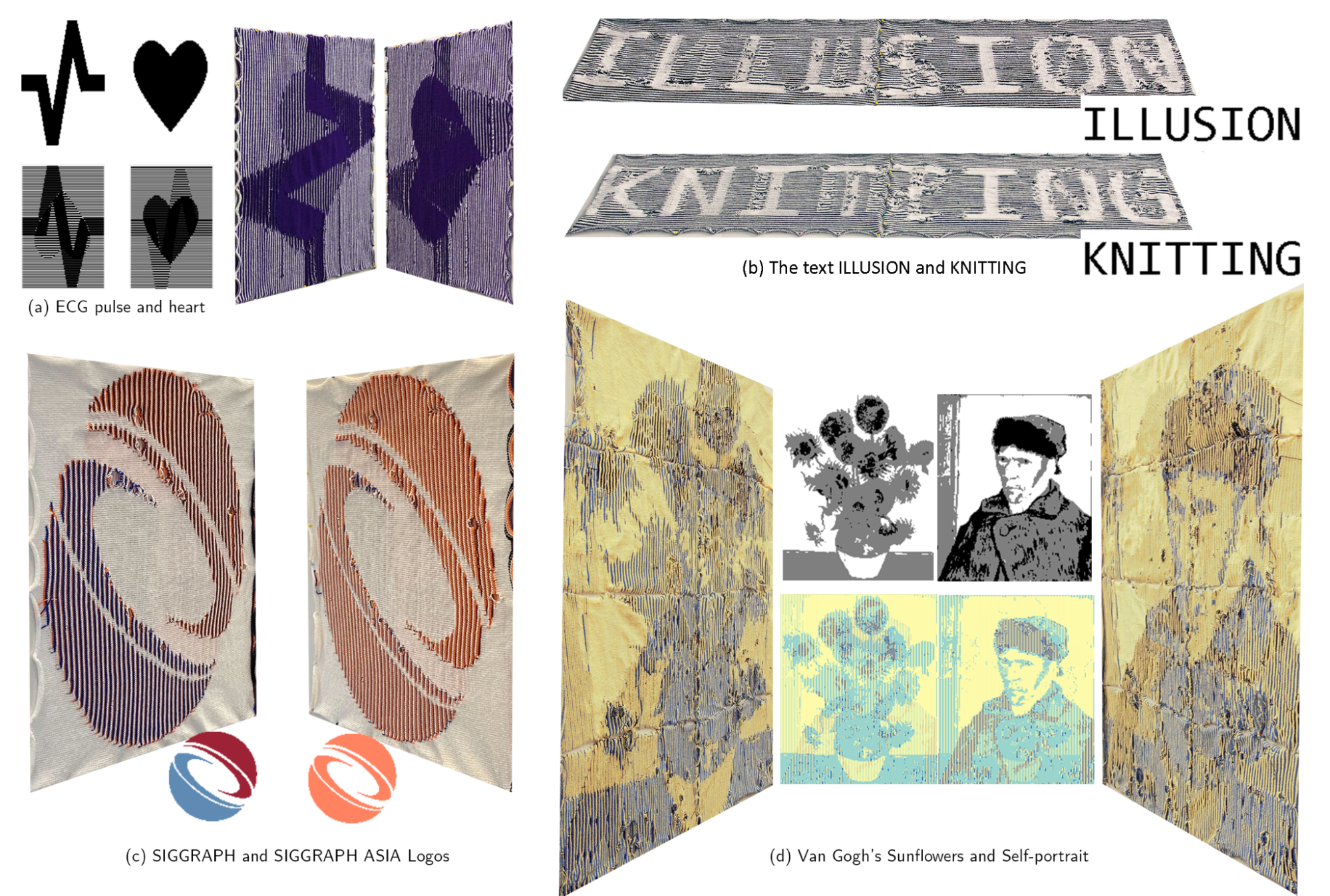
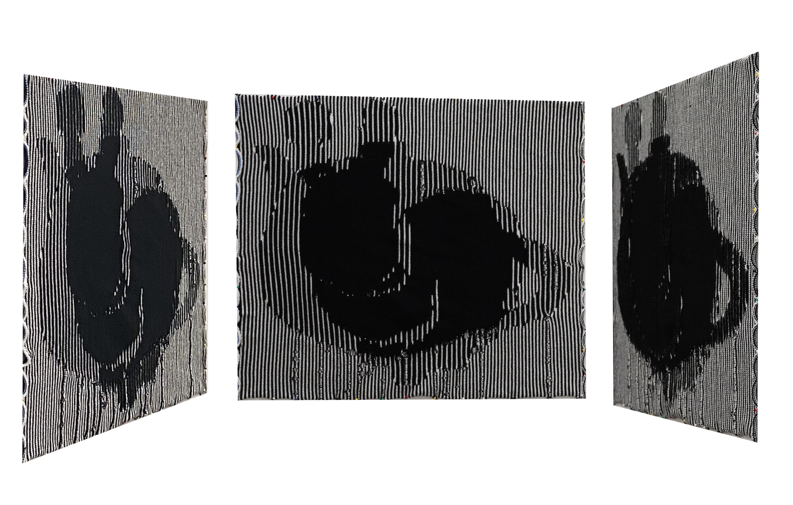
I’d like to note that in our framework, knitting long rows of stripes avoids within-row colour changes, and works up relatively quickly. The bunny/teapot example we have here only took about two hours to knit, compared to MaxSAT’s 12.
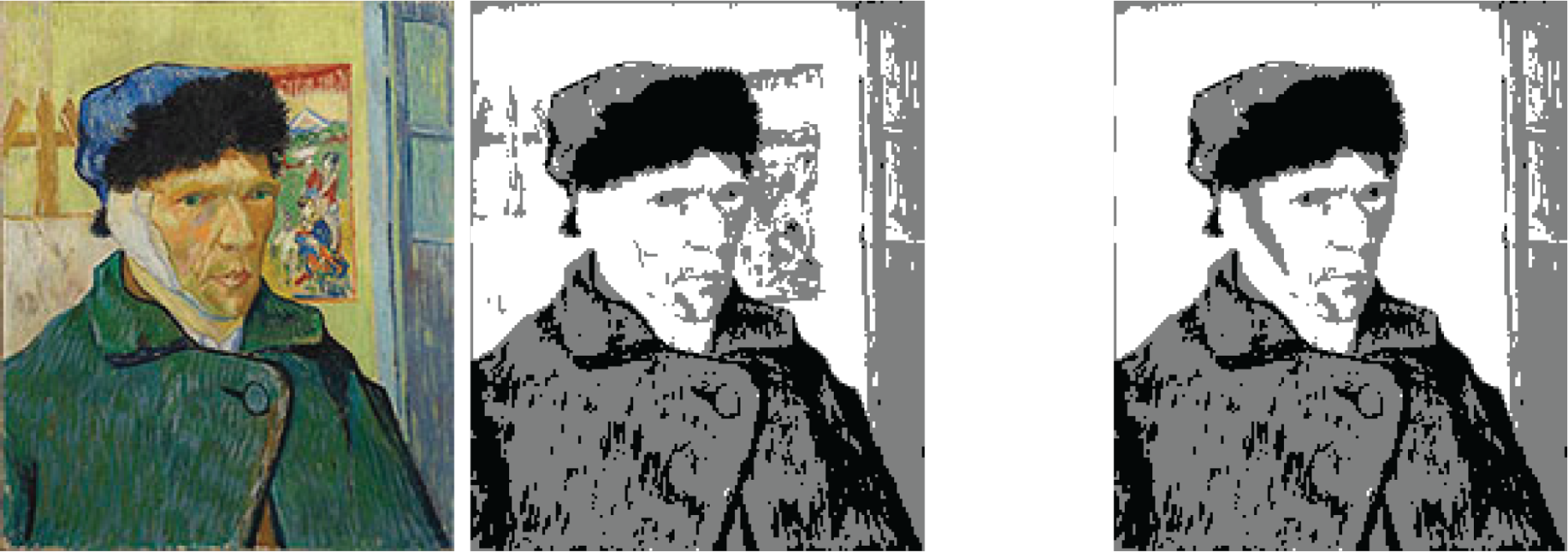
The other main benefit of our new system is that it’s easy and possible to directly manipulate the outcome! Oftentimes, in fully-automated approaches, it’s not clear how to edit the inputs or tweak the parameters so you get exactly what you want. Here, you can simply edit the input images, or modify the tiles. For example, for the Van Gogh Self Portrait/Sunflowers example, the quantized input had a lot of noise around his head that made the image much noisier. I simply erased that detail in MS Paint to get a cleaner result.
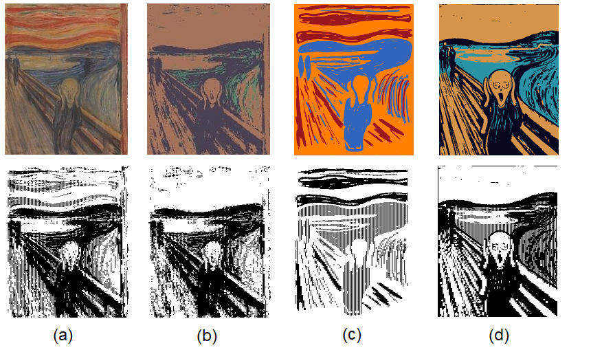
You could also experiment with different quantization methods. Below, we tried quantizing the Scream (downloaded from Wikipedia) four ways. (a) shows what happens when you use our default quantization method to process the image. (b) was processed with Adobe Photoshop’s posterize filter, (c) was hand-drawn in just three colours, and (d) was generated via stable diffusion.
As we return to the overworld, I’d summarize our journey thusly: we accelerated the design of single-view illusions, and developed a way to create the first-known double-view illusion knitting patterns! We did so by analyzing the constraints of knitted illusions, which depended on the physical attributes of knitting and by fabrication, discovering they were wildly overconstrained, and creating a system for relaxing those constraints with direct control. These advances allowed us to generate lots of cool illusions.
As a treat for reading my blog post, I wanted to share a couple other ideas that I worked on that ultimately weren’t fully-formed enough for me to disseminate anywhere else.
First, I tried to design this three-way illusion with one image from the left, one image from the right, and one image head-on. Because of the overconstrained nature of left/right, the head-on view is even more constrained, and can’t diverge from the intersection of the side view images.
I think it should be possible to create some interesting three-way illusions, but we’ll need to create better design guidance to make interesting examples. There might be a more relaxed constraint than the one I identified (the head-on view being within the intersection of the two side views), for example.
Second, I was very interested in making “animations” with illusion knitting. Like, if we put a knitted surface on a cylinder, we’d only be able to see so much of it at a time. What if we could walk around a knitted cylinder and see an “animation”? To do this, we’d create an object with multiple “frames” in the head-on view and the side view, and distribute these frames in space. Here’s an example:
The star is “growing” – it starts out small in the head-on view, and grows in the side view, and then you walk to the next star over and its head-on view is even larger.
In general, I wasn’t too happy with the effect of the illusion, as you can only have a limited number of frames, and I haven’t yet discovered an animation that really makes the medium pop. It’s possible that I need a different setup for capturing the animation, too – something more akin to a zoetrope and a faster spinning mechanism maybe?
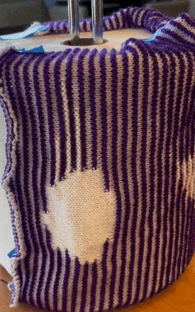
Third, I was interested in how draping the flexible surface over an irregular or hard surface would affect the results, similar to how the Lego illusion used triangles to get an occlusion effect. I haven’t tried making anything in this style yet, so if you think about it, why not reach out and let me know what ideas you have!
Acknowledgements. This work couldn’t have happened without my fellow experts, Yuxuan Mei and Ben Jones, and my advisors Zachary Tatlock and Adriana Schulz. Also shout-out to my solvers class group project partners, Raymond Guo, Kaiyang Wu, and Jimmy Cheong, as we worked on the constraints and MaxSAT formulation together. Finally, thank you so much to Sorawee for editing this blog post and for all your valuable feedback!